Wednesday, April 25, 2007

Public Space vs. Private Space

Assigment:
In a series of digital photographs identify /document or create physical or conceptual sites of public art. At least one of the sites should be private.

Use photography as your critical tool to introduce questions, express attitude or to tell a story. Reinforce your ideas in the way you present the work.


Location:

Various locations in New York City.

What is it?

They are restroom utilities altered in an artistic way to have a more appealing different feeling.

Response:

These are my favorite images of art I would say. Can you truly categorize these artistic forms as public or private art? It is kind of funny to think of a urinal as public art. I guess these forms give new meaning to DuChamps installation of the urinal.


Location:

Downtown Troy, Near the waterfront

What is it?

This space is a type of outdoor stage with seating. There is a cascading waterfall around the stage.

Response:

This is the best art of all, it’s art that can be used, it has a function. I beleive this form of ppublic art is great. The space is completely user interactive and the waterfall is nicely articulated. But how far should we take the term public art, noticeably there is no painting. The art is in the form of structure and form through concrete.


Location:

Downtown Troy, Near the waterfront

What is it?

It is a monumental concrete pillar with each side embedded with an artistic painted circular symbol.

Response:

I am classifying this piece as public art because it is along the streetside for all to view. This piece is a form of advertisement also, for the riverside park. I wanted to pose a question of, is all advertisement considered public art, and what are the thoughts of this being considered as public art?

Space Transforming Ideas

Description:

This part of the project was to gather ideas and come up with ideas that you could explore on the site. Here i made diagrams and quick drawings of how the site could interect with installations of large sculpture, like Cristo.


Community Scale

Physical intervention with the application of specific materials to alter the appearance.

Due to scale and legal issues of actually doing it, it was not possible to actually do this at this point.

T
hese pictures were brought to the site where i asked passerby’s their opinion.

Would this attract you to the space more, would you then use it more?


Can another function be added, ice rink to double in winter with a seasonal art display?


Urban Scale


Most opinions were positive. Yes they would be
aware of the space more. It would be visually appealing. On this urban scale it may draw more people to this area because of how far it can be seen.


Installation of Community Involvement


Description:

The site is a public park which has a small concert venue a nd plenty of open green space. The issues I have discovered with the site are that it is beautiful, but not used often enough. As the first stage of my project I tried to bring people into the site by asking them what they would want to see there. I placed posters and advertisements in and around the site asking people for advice as to what they would like to see at the park, and that would make them interact with the site. Just by placing the questioners in strategic places, like the bench or the commemorative post, I activated the site. People entered the park curious about the posting a nd other people’s response to the question. I checked daily on the writings. Some of the s uggestions included:

-
altering the view from across the river of the oil tanks

- repair and use the fountain to uplift the community

- playground for kids

- sculptures and music

- avenue like Washington Park in Manhattan (music, plays, bbq’s)

All the responses were very interesting and helpful. Some of them repeated, maybe affected by what people

already said, and one out of about 20 responses said to keep it the way it is.

In the second part of the project I was going to attempt on weekly bases to fulfill the wishes of those future happy park users. Unfortunately this semester I ran out of time, but it certainly is a good possible material for my theses project in the future.

Exposed


The purpose of our project was to enhance a community space and promote interaction using mirrors. We trusted that the mirrors’ ability to create illusions would be interesting to work with. Initially, we talked about placing a tripod of mirrors in the middle of a busy walkway. People walking towards the tripod would be able to see their faces but the body of another person. We were told that although this might be interesting for the individual on his or her own, it would not spark any kind of interaction.

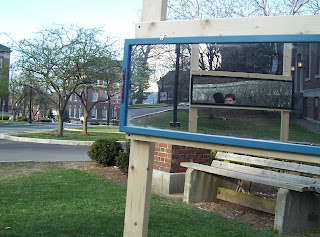
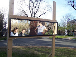
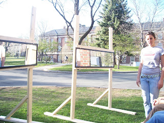
After that, my partner and I decided that we would have to create a space using these mirrors that would draw people in and experience this space with others which could possibly lead to some interaction. We built three stands to hold a 4.5’ x 1’ mirror each where the mirrors would be placed at eye level (about 5’8” center). We then would orient these stands in a semi-enclosed formation. Standing in this space was rather interesting because one could see various angles of him/herself as well as that of the other people in the space. It became very surreal and almost confusing.

At a project review we were told that it was precisely the kind of interaction needed, except it lacked something that would make the participants want to stay and enjoy it a little bit longer. We briefly discussed the idea of building attached benches until we realized that it would be better to use bench areas around campus. Because students are already used to those community spaces, they are more likely to participate in the installation. Placing these stands around seating areas required that the mirrors be lowered to sitting eye level. This was carried out as well.

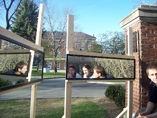
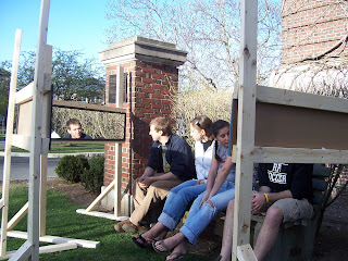
The installation was set up outside of the Greene Building at RPI in a grassy bench area. Some of the students sitting around at the time agreed to participate in our project. They rather enjoyed the effect of the mirrors in the space and all agreed that the more spaced out they were, the more inviting the space was from the outside. The photographs demonstrate how the space was used and the different angles that could be viewed by the participants. Unfortunately, the full effect of the space cannot be experienced through the photographs.


Exposed: Part 2


One of the biggest criticisms of the first iteration was that my partner and I did not experiment enough with the different spaces that could be accomplished using the mirrors. In this iteration, we created two different settings.
The first setting was done using one bench and enclosing it with the three mirrors as tightly as possible. Passer byers actually wanted to see what it looked like from the inside. They openly admitted that it was a little uncomfortable being exposed from every angle to these strangers. However, I was impressed at the success of this setting in that these strangers came closer together and actually sat and chatted for a while.
The second setting was done using two benches situated at right angles from each other, and the three mirrors oriented in a way that would capture the reflection of another mirror. It was interesting to see how, even with the participants sitting at a comfortable space from each other, they still felt extremely close to one another because the mirrors made it impossible to not see each other.
This project was successful in heightening the experience of someone casually sitting and talking with people. It was interesting to see their reactions which can be see in the pictures below. All in all, we had a great time working on this project.